Mediservice, Provider Portal Redesign
Role: Experience Designer, UX Researcher, and Service Designer (the lines were thin, all three applied). Project: End-to-end redesign of the provider portal across three connected streams, 2020-2021. Collaborators: Sheila Ponath (UI/UX) first, then Thaís Fogaça (UI/UX) after Sheila left. I led research and low-fi prototyping; the designers took it into high-fidelity.
Cut the main authorization form from 8 to 5 minutes, directly against the institution's TMA KPI. Reduced call-center traffic by 20%. Increased approved authorizations by 12%, eliminating the back-and-forth where providers had to re-submit documentation later.
On a portal serving ~500k beneficiaries across 50 enterprise clients (Volkswagen, Caterpillar, Unilever among them), at a corporate health operator with 35+ years in the market.
Context
Mediservice operates the corporate health plan for ~50 large enterprises in Brazil (Volkswagen, Caterpillar, Unilever and others), covering ~500,000 lives across 382,000 individuals, with 35+ years of operation and ANS registration nº 333689.
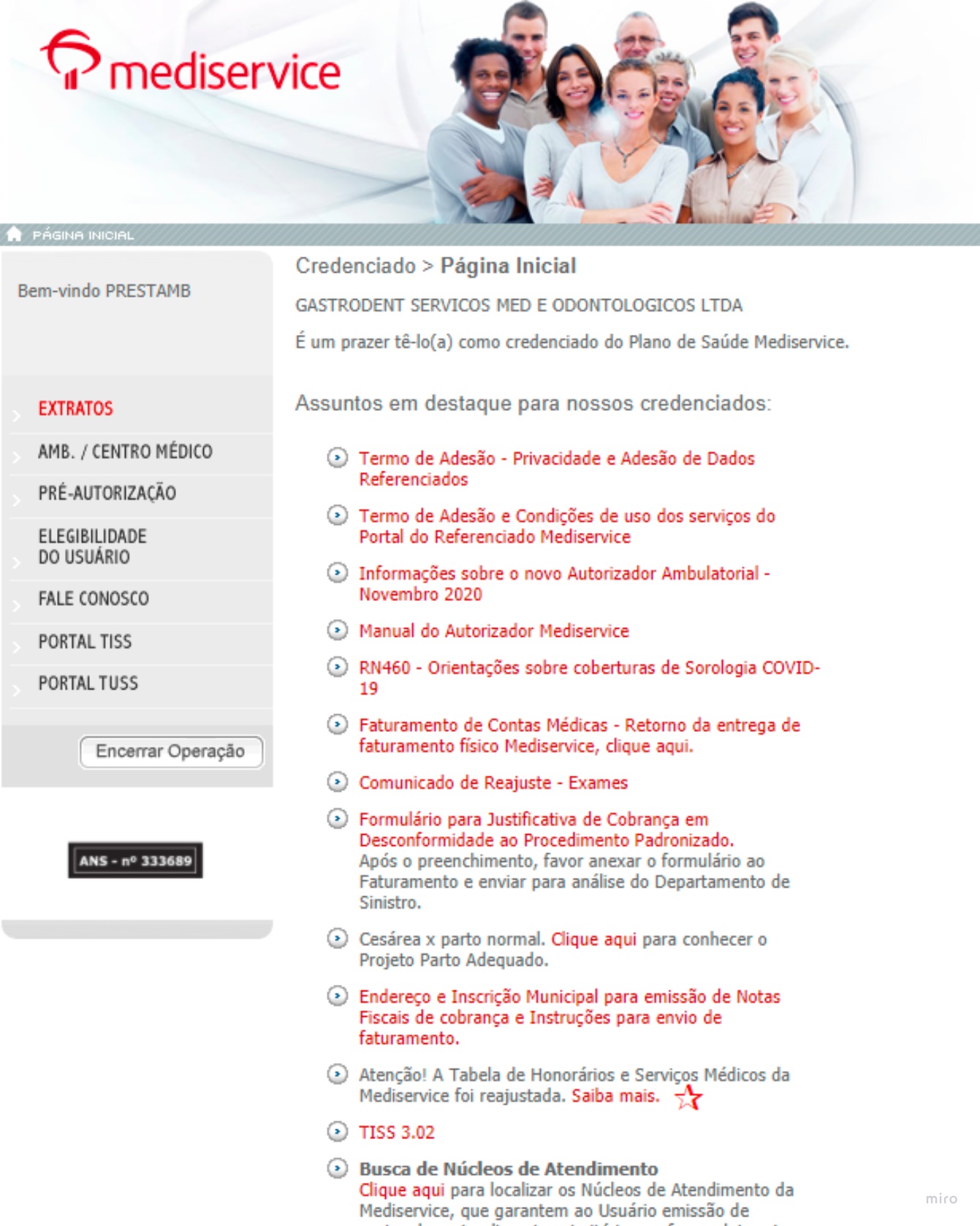
The portal hadn't received a significant update since 2008.
This was the deepest research-and-service work of my career. Three connected streams, real methodological rigor, and stakes that mattered. The work ran across 2020-2021.
The problem
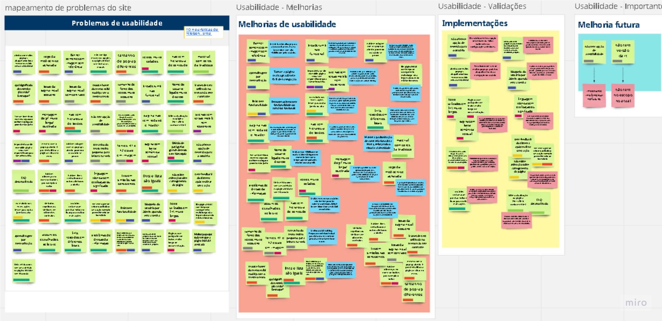
Providers hated the portal. Veteran users coped through memorization, building muscle memory for a broken system. Every new credentialed clinic, hospital, or lab faced a learning curve that violated almost every Nielsen heuristic at once.
The downstream effect was operational. Providers stopped trusting the portal and called the support center for help, draining a channel that was supposed to be exceptional, not routine.
Three pain clusters surfaced in discovery:
- Opaque homepage, buried navigation, unclear hierarchy, no signal for what to do first.
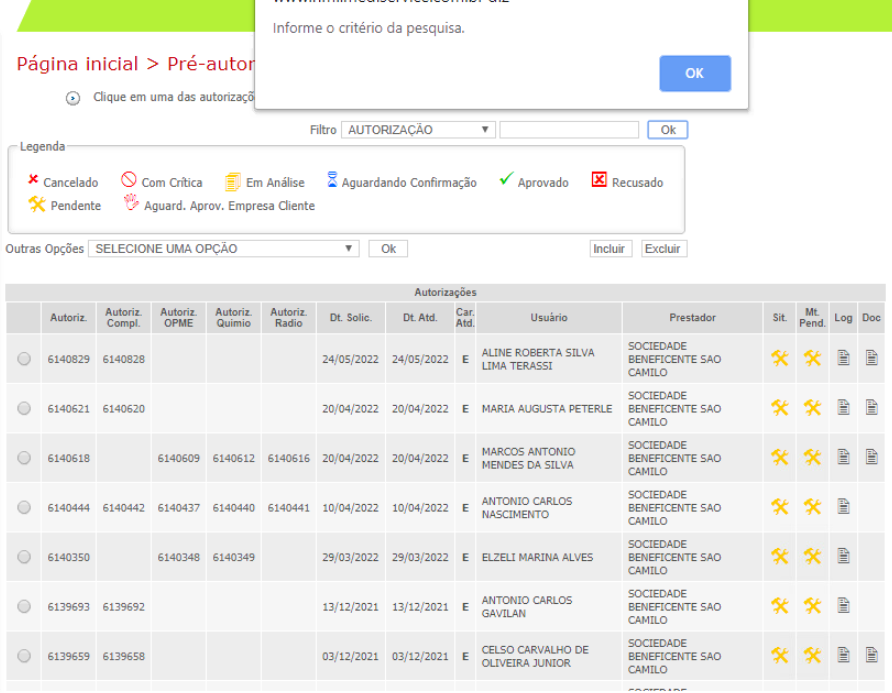
- A convoluted authorization request flow, a long, rule-heavy form where providers didn't know which procedures required which documents, causing rejections and rework.
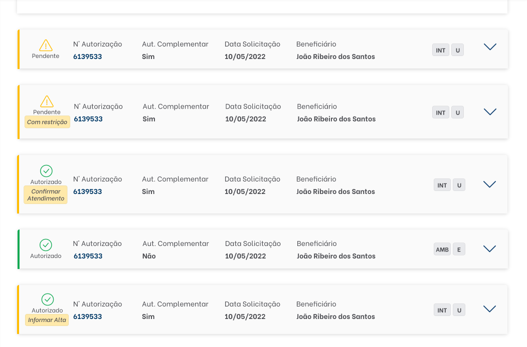
- No transparency in request tracking, once submitted, providers had no clear sense of what was happening. Confusing statuses, no follow-up signal, no recovery path.
A turning point in discovery
The single most useful insight came from interviewing both providers and business leaders. There was a disconnect between what mattered to the business (forcing compliance comms to be read) and what mattered to the user (completing the journey: authorize a procedure, get paid, move on).
That framing changed the brief. The redesign wasn't "modernize the portal"; it was "stop forcing providers to fight the institution every time they used it."
How I worked
I led research and built low-fidelity prototypes jointly with the UI/UX designer; they took the work into high-fidelity. The work spanned three connected streams, and the methods adapted to the problem of each stream rather than running a generic playbook.
Across all streams, the core toolkit:
Discovery. Technical interviews, in-depth interviews, nominal stakeholder mapping (each function tied to its real owner inside the organization: Sinistro, Autorização Prévia, Aluguel de rede, SAC, ANS interface, billing-side), and journey mapping by credential type (clinic, hospital, lab, dental).
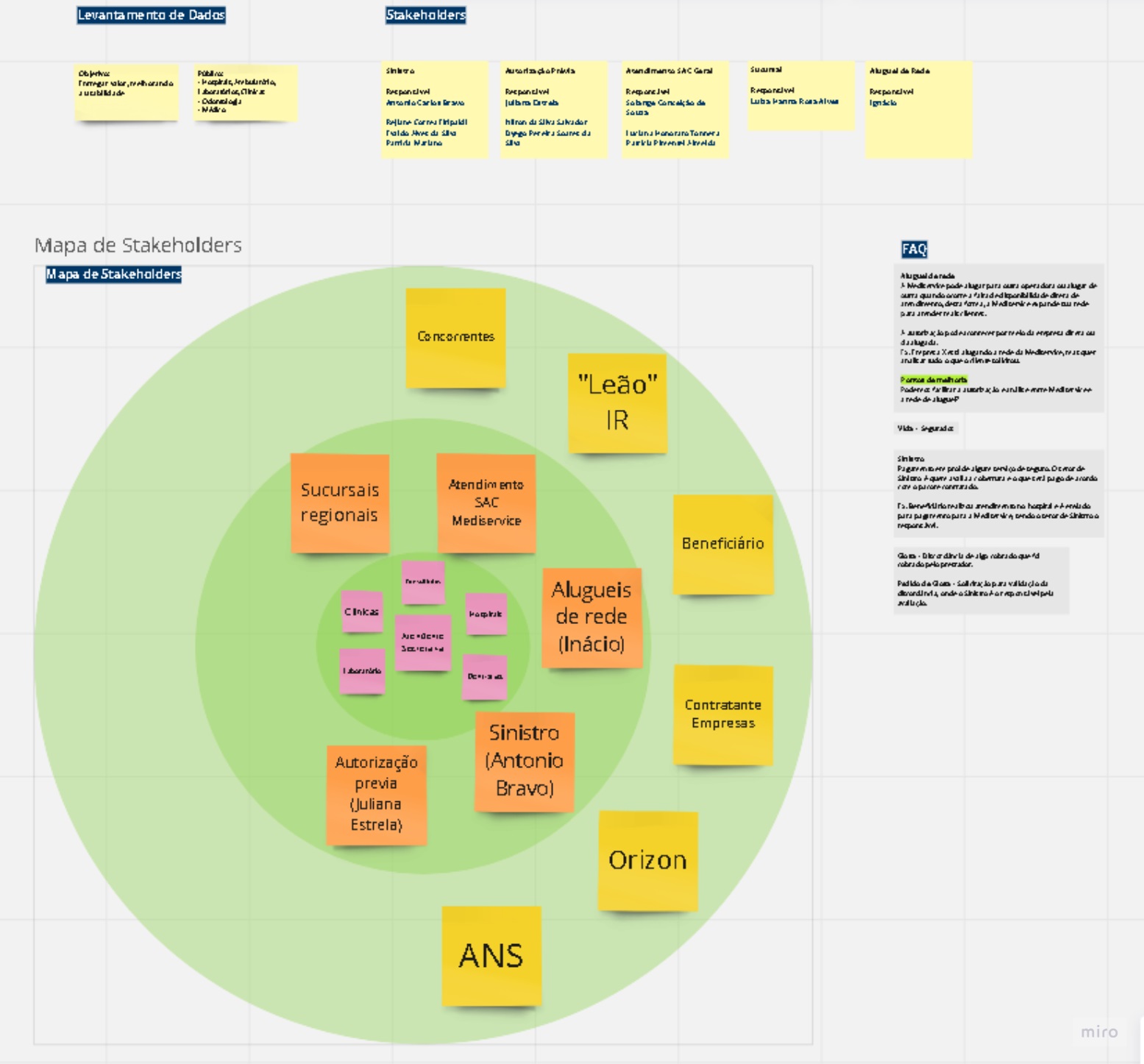
Analysis. Lean Canvas adapted for UX, Desk Research, Benchmark, Nielsen heuristic evaluation, PESTAL analysis (applied specifically to the authorization flow), Atomic Research as the qualitative synthesis method.
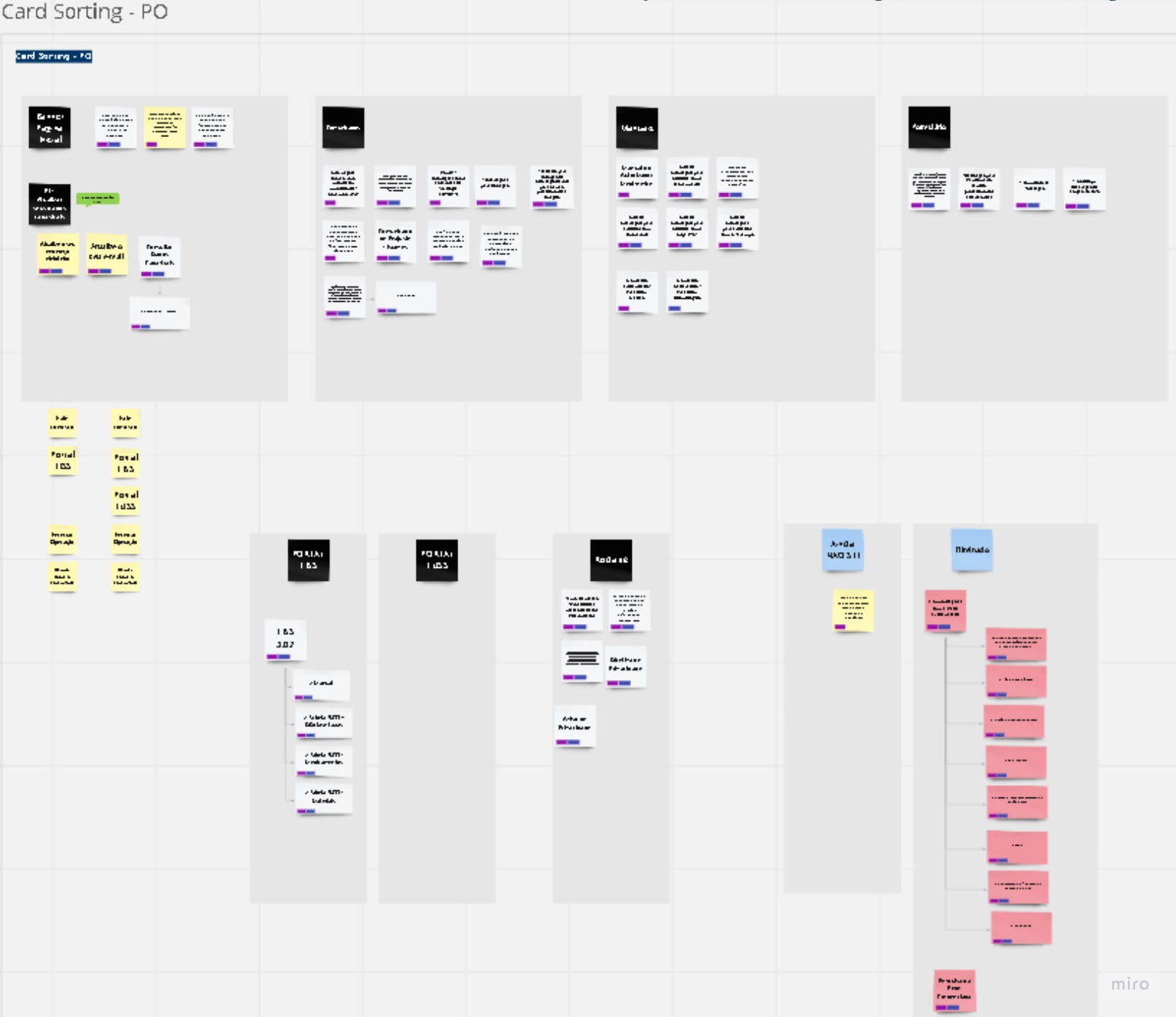
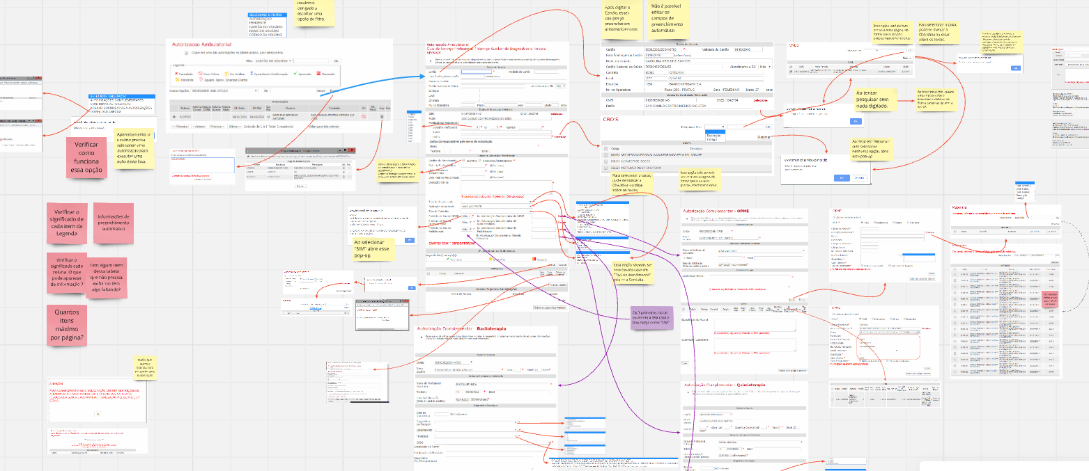
Co-creation. Card sorting, ideation, low-fi prototyping with the designer, validation rounds.
Testing. Usability tests, System Usability Scale (SUS) quantitative questionnaires, A/B testing on the tracking redesign, Analytics and Hotjar instrumentation.
Throughout, Atomic Research was my synthesis discipline, atomizing user-interview findings into reusable insight units that fed each stream without forcing re-reads. The same method I still use today with LLMs in the loop.
Three connected streams of work
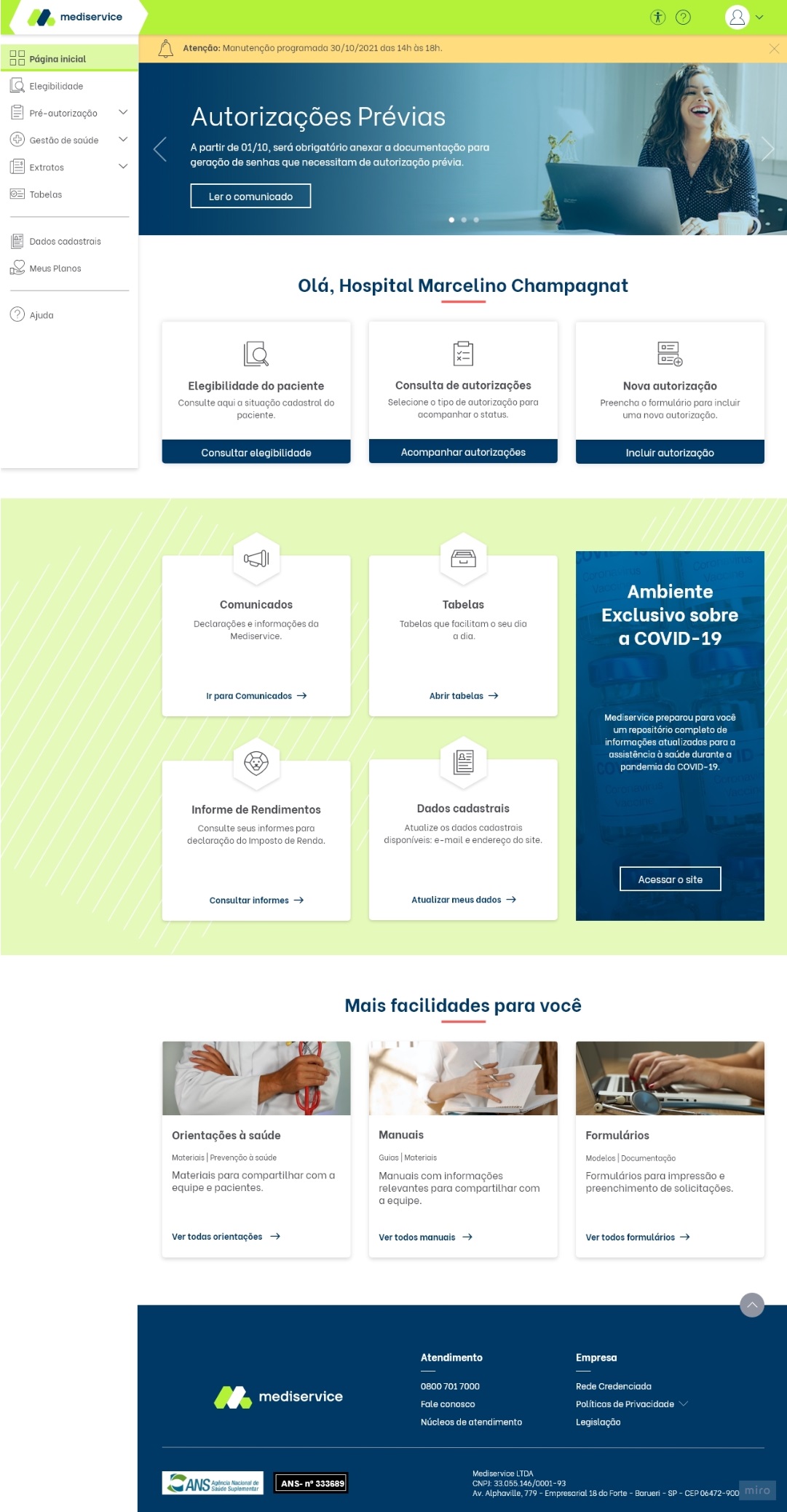
Homepage redesign
Hierarchy rebuilt, menu reorganized, business communications repositioned without breaking the user journey.
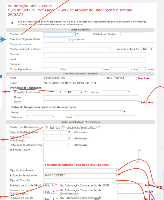
Authorization request flow
7-step wizard with step-by-step validation. Documents required per procedure made explicit upfront.
Authorization tracking
Clearer state machine, legible status feedback, simpler multi-step actions for follow-up.
Stream 01 / Homepage redesign · with Sheila Ponath
Before. 2008 layout, buried navigation, no hierarchy signal, communications competing with primary actions for attention.
Approach. Card sorting, Lean Canvas (UX-adapted), Nielsen heuristic evaluation.
Outcome. Hierarchy rebuilt, menu reorganized, less-used features grouped or eliminated. Communications repositioned without breaking the user journey, resolving the disconnect between business priority and user priority.
Stream 02 / Authorization request flow · with Thaís Fogaça
Before. 30+ field form, no per-step validation, no progress signal. Providers didn't know which procedures required which documents, leading to rejections and rework cycles.
Approach. PESTAL analysis, journey mapping by credential type, Atomic Research synthesis.
Outcome. 7-step wizard with step-by-step validation. Form completion 8 minutes to 5.
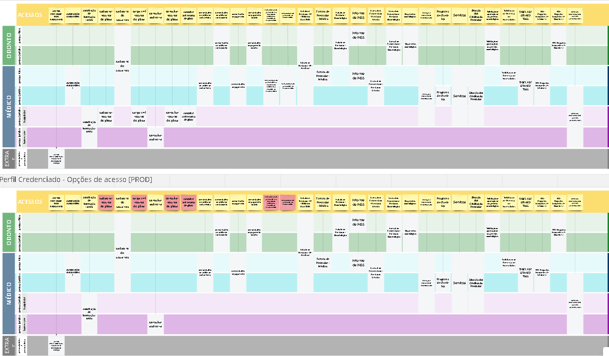
Stream 03 / Authorization tracking flow · with Thaís Fogaça
Before. Opaque statuses, providers calling support to ask "what happened to my request?"
Approach. A/B testing, Analytics and Hotjar instrumentation on the redesigned status page.
Outcome. Clearer state machine, legible status feedback, simpler multi-step actions. 20% fewer support calls, 12% more first-pass approvals.
Impact
- Form completion time: 8 minutes → 5 minutes (~37% reduction). Direct hit on TMA, multiplied across millions of authorizations per year.
- 20% reduction in call-center traffic. Providers stopped needing to call to clarify status.
- 12% increase in authorizations approved on first submission, without requiring follow-up documentation. The classification work paid off.
- Stakeholder alignment on service-thinking. The org moved from "the portal needs a refresh" to "we have to design the service, not the screens."
What I'd flag in an interview
Service over UI. The redesign wasn't a UI problem, it was a service problem. Once we mapped the full stakeholder network and the parallel jobs each provider type was doing, the brief stopped being about screens and became about removing institutional friction.
Atomic Research as the qualitative engine. I was already atomizing user-interview data into reusable insight units before AI made the practice fashionable. That method is what made the three streams reusable instead of three disconnected research projects.
Healthcare B2B has unforgiving stakes. The portal operates inside ANS-regulated TISS 3.02 standards. Every authorization is a regulated medical-financial event. A wrong status can delay a surgery; a misclassified procedure breaks billing compliance. That sharpened how I designed feedback states, error recovery, and the boundary between assistive automation and human review.
Constraints + what we left on the table
We scoped accessibility options and a dark mode out of the launch, with both documented as priority for the next cycle. A full visual identity refresh was also deferred. The choice was deliberate: hit the three streams that drove TMA, support calls, and approval rates first, then iterate.
Why this case sits here
Mediservice is the bridge between two halves of my work. It's where I went deepest as a researcher and service designer in a regulated B2B context, and where Atomic Research crystallized as a method. Everything I'm doing now with LLMs sits on top of that foundation.